Week 7
Lecture: In week 7, the fundamentals of website layout is about balancing aesthetics with practically. A good website layout organizes information so it fits together in an obviuos sequence. It also makes the page visually engaging, guides the user's eyes towards points of interest. It plays a role in branding too, using spacing, alignment and scale in ways.
Lecturer say visual hierarchy is a way of styling the design elements for heightened contrast in order to emphasize select pieces of content above others. Reading pattern describe the most common ways users scan pages and re depicted in directional lines. The fold is the line at which a web page is cut off due to the screen size limitations. A grid system is a layout based on rigid measurements and guidelines. White space sometimes claeed negative space, is simply the area of a design without any content-that is, the empty space.
Lecturer also talk about the common types of website layouts, first is single column layout. A single column layout is one in which content is arranged sequentially in one column. Two column layout in a split-screen arrangement, displays content side-by-side. Asymmetrical layout, simply achieves this in unexpected ways, such as pairing a large-scale visual on one side with many smaller elements on the other.
Practical & Tutorial: On week 7, lecturer ask us to design Flowcharts, Sketches, Wireframes & Mockups. First, we need to design flowcharts before started drawing sketches or digital work. This is because we need to list out the content we want to put in our website, to make us clear when design the website.
 |
| Flowcharts |
This is the flowcharts that I design, in my website I will include Homepage, About, Portfolio and Contact. In homepage, that will have artwork images and welcome page. In about page, there will have introduction and design work, portfolio page will have my four portfolio showcase and the last is contact page, will list out my contact number and my social media.
.jpeg) |
| Homepage |
.jpeg) |
| About Page |
 |
| Portfolio Page |
 |
| Contact Page |
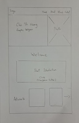
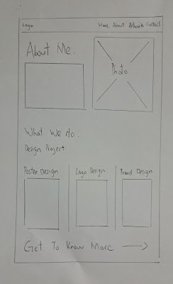
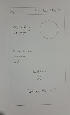
This are the sketches that I have draw, which have homepage, about page, portfolio page and contact page.
 |
| Homepage |
 |
| About Page |
 |
| Portfolio Page |
 |
| Contact Page |
After finishing the sketches drawing, I started work on the low-fidelity wireframe. The low-fidelity wireframe is a digital skctches with no color, only layouts. This is to sketching the overall layouts of website and can adjust it on high-fidelity wireframe if need changes.
 |
| Homepage |
 |
About Page
|
 |
| Portfolio Page |
 |
| Contact Page |
This is the high-fidelity wireframe, also the final website layout design. In the high-fidelity wireframe, I include color and picture to make it look more complete. The overall design of my website is using simple and minimalist, it using a lot of font and empty whitespace to look like simple. I will only include the important stuff and the information only. The navigation bar is design with font, Click. When visitor tap the Click button will take them to next page. Other than that, is all font and picture only with little social media icon, this is my website design style, modern and minimalist.


.jpeg)
.jpeg)


Comments
Post a Comment