Week 3
Lecture: The third week's lesson focuses on content design and layout, with colour serving as the primary topic of discussion. Now is the time to hone our design skills and immerse ourselves in the world of design. Learning how to make a nice website layout is essential. According to the lecturer, a website layout is a framework that establishes the organisation of a website. The website's layout plays a crucial role in highlighting its essential components and creating an easy-to-navigate path. A website's objectives are to increase user interaction, create visually appealing pages, and arrange its content.
The first piece of a website's design that the lecturer discussed was the header. The simplest navigational components that communicate a website's core structure are always included in the header.
 |
| Website Header |
Second, the term "page body" refers to the major body of a web page, which includes the primary messaging and visual content.
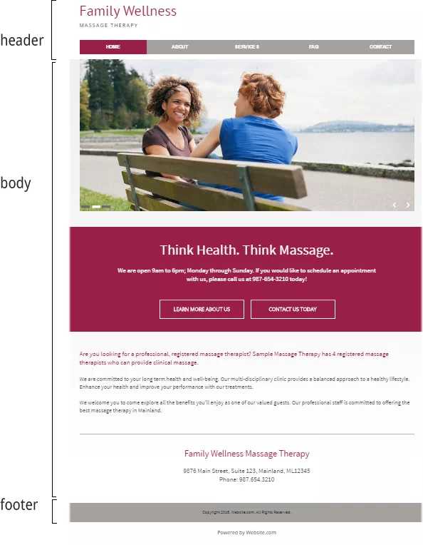 |
Page Body |
The third option is a navigation menu, which can be a sidebar, hamburger menu, mega menu, subheader, scroll-triggered, sticky, or fixed menu, among others.
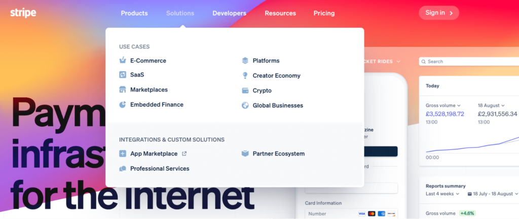 |
| Navigation Menu |
The website footer is the fourth element. Regardless of their height or length, footers typically include links to social media platforms, copyright disclaimers, privacy policies, and other optional things.
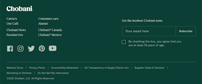 |
| Website Footer |
In addition to discussing website design, the lecturer also covered website layout. A single column layout is the first kind of layout. It displays one vertical column with the primary material.
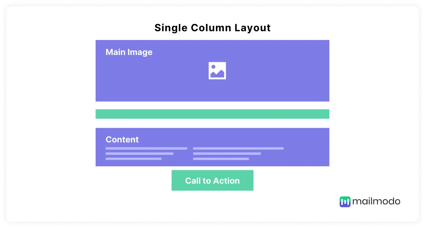 |
| Single Column Layout |
Two column layouts are the second kind of layout. The screen is divided into two vertical parts by this division into two columns.
 |
| Two Column Layout |
Split-screen layouts are the third kind of layouts. It appears when the main content area of a page is split into two or more vertical sections.
 |
| Split-screen Layout |
Asymmetrical layouts are the fourth kind of layouts. These consist of full-sized images, images with filters, plain squares with a background that is solid, and text that is centred.
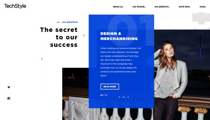 |
| Asymmetrical Layout |
Grid layout is an opportunity to showcase many visuals and works of art in one interface. Always a balancing act in web design, the challenge of juggling different color contrasts.
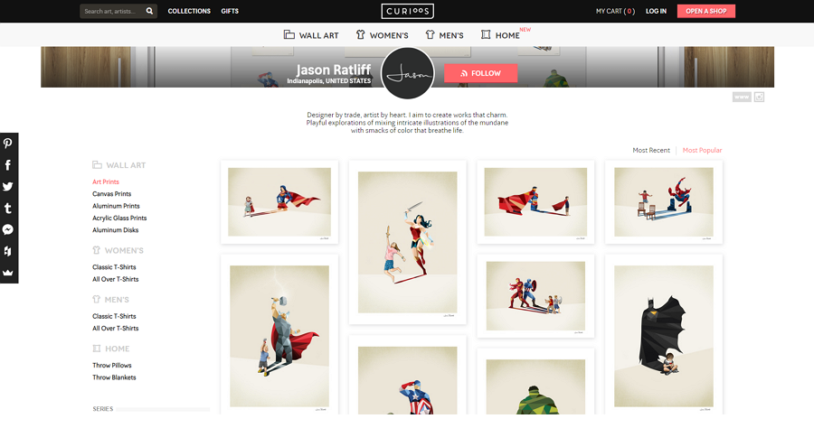 |
| Grid Layout |
Practical & Tutorial: On week 3, lecturer required us to design a website banner by adding our picture inside and our name. This is to design a banner which can put at the website homepage in order to let visitor can see it. Before started design a website banner, lecturer ask us to find references first to see which design layout we like and want to apply in our website banner design. Therefore, heres are some website banner references I have found.
The website banner I have found is kinda style of simple and minimalist, it do not have many colors and the content is very less, only have some information include inside and the picture only. I like this website banner design style due to the clean feeling and also modern, therefore I will apply this style in my banner design.
 |
| The sketches of website banner |
After finish drawing sketches, I started design it on digital.
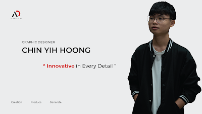
This four website banner digital design is the digital sketches only, heres the final design that I pick to put it on my website hompage.
 |
| Final Design |
Basically the design of website banner is following the references I have found on pinterest, is based on minimalist and simple as the visual concept to design this website banner. It include my photo, my name, my slogan and my logo as well. It brings clean feeling when look at it, do not have much fancy stuff to interupt the attetion from visitor.



Comments
Post a Comment